Historical Conceptualisation of the Logo
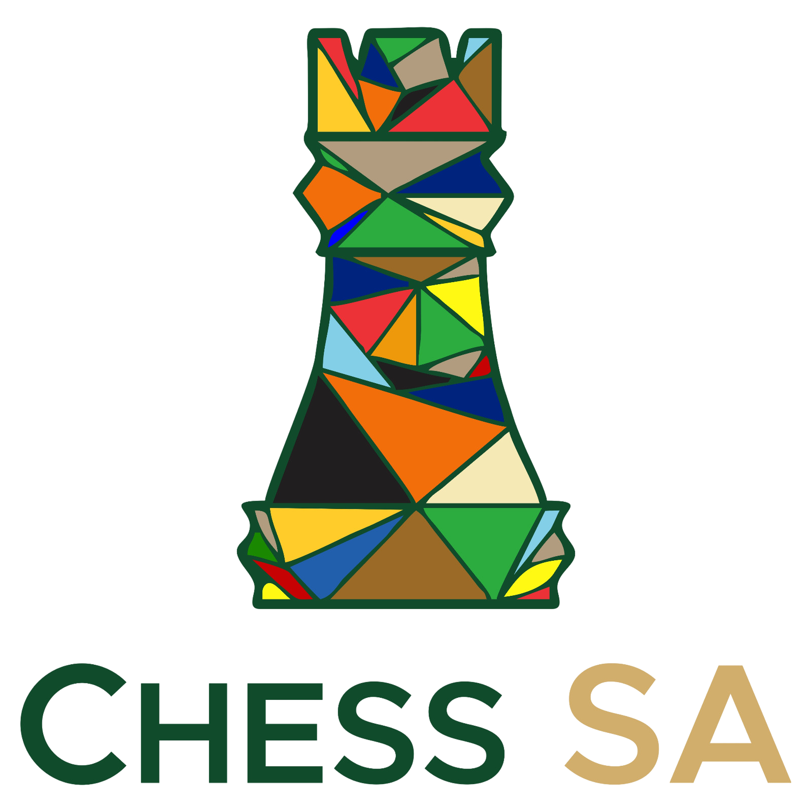
The logo stands as a powerful emblem of unity and solidarity among South Africa`s provinces in their collective effort to advance chess nationwide. Designed in August 2022 by graphic designer Ms Jayne Hatting from De Aar, the logo incorporates the colours of each provincial chess emblem into a single chess piece, symbolising their shared commitment and collaboration.
The abstract, mosaic-like composition of the chess rook reflects the diversity of South Africa`s chess community while reinforcing the ideas of strategic strength, resilience, and structured development. The rook, a piece renowned for its stability and pivotal role in chess strategy, was selected to represent the unwavering dedication of the provinces to growing the sport at all levels.
By seamlessly blending the distinct provincial colours into one cohesive design, the logo encapsulates the vision of interprovincial cooperation—where each province contributes its unique strengths towards a unified national chess movement. It serves as both a historical marker and an aspirational symbol, reinforcing the notion that chess in South Africa thrives through collaboration, inclusivity, and shared goals.